
Monday, April 25, 2011
Timeline - Final
Wednesday, April 20, 2011

Friday, April 15, 2011
Timeline -Rough Draft

I Put together a layout for how I am going to do my timeline. Everything is drawn by me and all pictures used will be drawn as well. I have to try to figure out how to fit all my information on the page without going too big in size and without being cluttered. Each bird will represent a date and I was thinking about using speech bubbles for each event.
Thursday, April 7, 2011
Infographic - Final

Wednesday, April 6, 2011

Monday, April 4, 2011
Scott Campbell

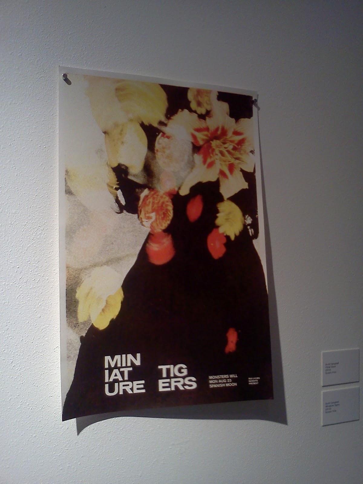
All of Scott Campbell's work was great. You could easily spend a good bit of time just looking at one print because of the detail put into each design. I like the idea of looking at how text changes a design. In the miniature tigers poster above, both pieces are very interesting to look at. The colors and composition of the cropped version of the poster is very strong. When the text is added, and the black area of the poster is lengthened, the piece takes a pretty big change. The contrast is a lot higher and viewing more black really makes all the other colors pop. Both of the designs work very well and hold my attention for a long time.
Albert Exergian

I really enjoyed the TV show posters that Albert Exergian did. My favorite one is the Knight Rider poster. Someone who is unfamiliar with the TV show would just see 3 rows of red bars of different graduations and wouldn't understand the reference. To someone who is familiar with the show, you can clearly see that it is not just 3 rows of red bars, but a reference to K.I.T.T, the car in night rider. All of his work in the gallery is very clean and minimalistic, which is a difficult thing to do well. All of his posters are fun to look at, both seeing cleverness in his choice of which symbol to use to represent the show, as well as trying to figure out the connection behind the images in TV shows you aren't as familiar with.
Subscribe to:
Comments (Atom)