Monday, January 31, 2011
Tuesday, January 25, 2011
This symbol stands for the medical profession. It is world wide, and upon viewing this symbol on a map or a sign, one would know where to find a hospital or medical center.
The same goes for this symbol. The common graphic that represents an airport is easily recognizable and can guide someone to an airport should they need to find one.
(http://www.tldm.org/News10/Hammer3.png)
The communist symbol is another widely recognized graphic. The graphic can stand for revolution, the proletariat, the peasantry, agriculture, or international solidarity. Communist states, parties and movements use these symbols to advance and create solidarity within their cause.
When I looked at this image, I immediately thought of other symbols that guide or instruct. Of these symbols, I thought of were:
The common cross walk symbols are seen every day. They are simplistic, and by using both color and identifiable shapes, someone who wants to cross the street is informed of when a safe time to cross would be.
This image has a couple benefits. It is the neighborhood watch symbol, and it both instructs thieves away, as well as providing security for ones home.
Though the graphic is not as simple, and is more of a literal direction, legos use the same principle for the design of their construction manual. There are no words, but simply the pictures of how to assemble the blocks and what order to put them together in.
After viewing this image I was reminded of other symbols that are very similar:
This graphic is a warning message used by nintendo before most of their games on the Wii console.
The message uses graphics to show how to properly use the controller, and to be aware of how close you are to things so you dont make the mistake of hitting them.
This is a sign that would be put in a park, or anywhere animals might be. It instructs the viewer to not feed the animals.
This is a graphic all of us should be familiar with. It signifies that something is designated of a handicapped person. The symbol is used to prevent people from taking parking spots from people who would better benefit from them, as well as guiding people with disabilities to things that make access to a building easier.
Friday, January 14, 2011
Peace Sign
After reading the story of the peace sign and how the orientation of it has meant different things, I am immediately reminded of the cross symbol. Right-side up, it is the Christian symbol, flip it upside down, and it can mean anti-Christianity, or reference the cross of saint peter.
I am also reminded of the many signs of peace other than the infamous peace sign. Along with this symbol, there is also the peace hand sign as well as the dove with the olive branch, symbolizing peace on earth.
I am also reminded of the many signs of peace other than the infamous peace sign. Along with this symbol, there is also the peace hand sign as well as the dove with the olive branch, symbolizing peace on earth.
The Swastika
One of the stories behind the swastika is that it is a composition of "L's" standing for Life, Luck, Love, and Light.
"According to one source, Dr. Friedrich Krohn designed the classic Nazi Swastika in 1919. Unlike the rest of Germany, Dr. Krohn acknowledged the ancient Buddhist use of the symbol, and argued that the Nazi Swastika should point "anti-clock-wise" because the symbol signifies "fortune and well-being" to Buddhists.
Hitler demanded that the Nazi Swastika point "clock-wise," which Buddhists believe represents a "cessation" or "away from God.""
The swastika had many different meanings and is used in a variety of different cultures. I found a diagram of some variations of the swastika symbol.
Wednesday, January 12, 2011
Isotype
The simplistic art style of the isotype reminded me of the popular video game portal. The graphics are very minimalistic, clean, and depict things in a very simple matter.
I also found a chart made using isotype that shows the statistics of deaths in Iraq in the year of 2007. Isotype can be used for a large variety of things.
There is a pretty big variety of charts utilizing isotype. Follow the link for more.
I did a Google search for Gerd Arntz and found some more of his artwork aside from his isotype images.
Follow the link for more.
Symbols: The Alphabet of Human Thought
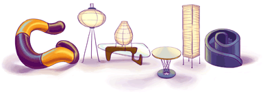
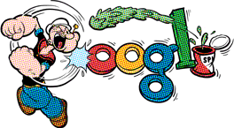
Reading this article about the different types of symbols made me think of the google doodles. Google has a very recognizable color scheme and the symbol is extremely well known. Even with some drastic changes to the font face, as well as some designs using no type at all, google is still easily recognized. The symbol has power and is a very good example of the power symbols have in our culture.
The website has a ton of different spins on the logo. I have listed only a few of my favorite:
The website has a ton of different spins on the logo. I have listed only a few of my favorite:
follow the link for more
The article mentions that chinese writing itself is an artform. The characters are pictograms, and while looking online I found some artwork made with chinese characters.
follow the link for more
I think it's very interesting to see how a brand or logo changes over time. I found a project done by the people at Antrepo4.com where they have redesigned a variety of products in a very minimalistic way.
follow the link for more
Tuesday, January 11, 2011
Exercise One: Icon Set
For my icon set, I used Arial. Arial is a font that was developed in the 1982 by Robin Nicholas and Patricia Saunders. Since the 80's was the age of digital technology, I thought it would be fitting to make a set of icons based on the electronic technology of the time. Arial is a sans-serif typeface and the simplicity of the letters lends well to the design I chose.
Modern Heiroglyphs
I read the article about modern hieroglyphs. (“Modern Hieroglyphs,” (PDF) chapter from Ellen Lupton’s Design, Writing Research)I have always thought it was very interesting that the same messages can be relayed across all cultures using a minimal amount of information in the form of a picture, sometimes accompanied with text. Though the text can help tie the images together, the images by themselves can relay the same message.
I immediately thought of the shopping cart rules on how to safely put your child in the shopping cart. Failure to follow the rules results in a higher chance of injury. The warning uses both text and pictures but the pictures by themselves would also be easily understood.
The next thing that came to mind was the wet floor sign. The sign uses both words and pictures as well. It is also a warning sign that informs us that for whatever reason the floor is wet and you might fall when walking across it.
While road signs do not depict the helvetica man, they do offer a lot of important information while still remaining simplistic.
Subscribe to:
Comments (Atom)


