I really like how the focus of the graphic are the objects themselves. I plan to do the same thing, and I will initially try to make vector graphics of all the audio technology. I also enjoy the orientation of everything on the page, and I am sure it will influence my design somehow.

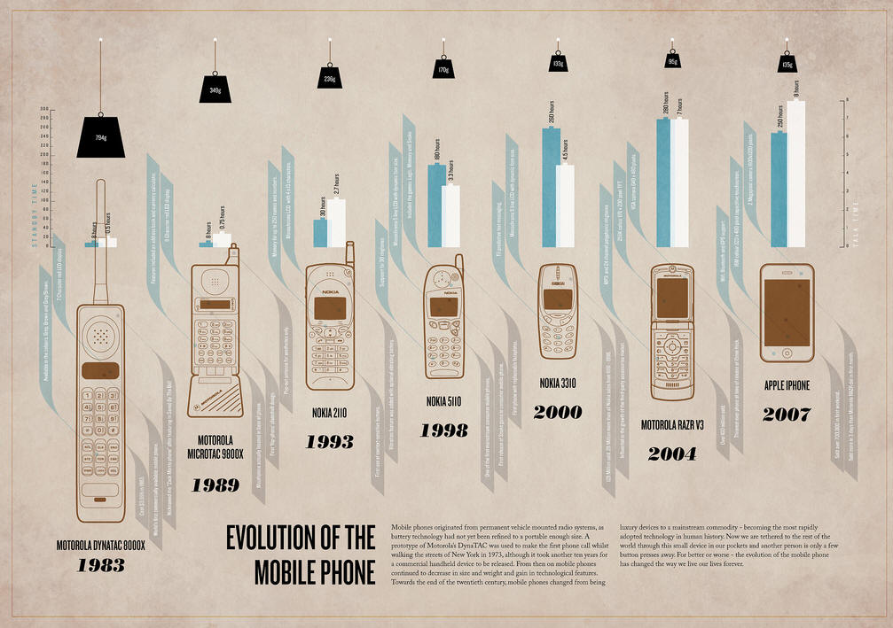
I like how this graphic displays all of the information with the timeline. The colors keep everything separate and it is consistency between all the elements. The timeline itself is one color, the text is another color, the graphics are the only thing on the page with multiple colors, and the background is another color. The use of color plays a very important role in infographics.
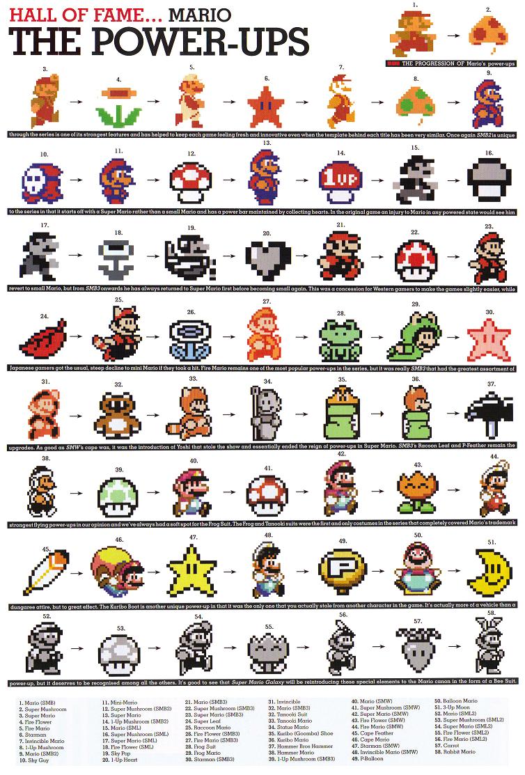
I like the way everything is organized in this graphic. I might incorporate arrows in my design, and I do plan on doing something linear from left to right as is used in this graphic.
No comments:
Post a Comment