
Monday, April 25, 2011
Timeline - Final
Wednesday, April 20, 2011

Friday, April 15, 2011
Timeline -Rough Draft

I Put together a layout for how I am going to do my timeline. Everything is drawn by me and all pictures used will be drawn as well. I have to try to figure out how to fit all my information on the page without going too big in size and without being cluttered. Each bird will represent a date and I was thinking about using speech bubbles for each event.
Thursday, April 7, 2011
Infographic - Final

Wednesday, April 6, 2011

Monday, April 4, 2011
Scott Campbell

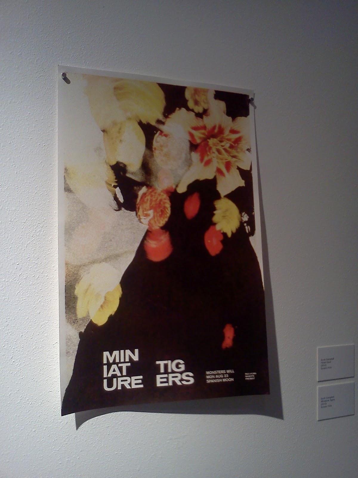
All of Scott Campbell's work was great. You could easily spend a good bit of time just looking at one print because of the detail put into each design. I like the idea of looking at how text changes a design. In the miniature tigers poster above, both pieces are very interesting to look at. The colors and composition of the cropped version of the poster is very strong. When the text is added, and the black area of the poster is lengthened, the piece takes a pretty big change. The contrast is a lot higher and viewing more black really makes all the other colors pop. Both of the designs work very well and hold my attention for a long time.
Albert Exergian

I really enjoyed the TV show posters that Albert Exergian did. My favorite one is the Knight Rider poster. Someone who is unfamiliar with the TV show would just see 3 rows of red bars of different graduations and wouldn't understand the reference. To someone who is familiar with the show, you can clearly see that it is not just 3 rows of red bars, but a reference to K.I.T.T, the car in night rider. All of his work in the gallery is very clean and minimalistic, which is a difficult thing to do well. All of his posters are fun to look at, both seeing cleverness in his choice of which symbol to use to represent the show, as well as trying to figure out the connection behind the images in TV shows you aren't as familiar with.
Monday, March 28, 2011

Monday, March 21, 2011
Infographic - Inspiration
I really like how the focus of the graphic are the objects themselves. I plan to do the same thing, and I will initially try to make vector graphics of all the audio technology. I also enjoy the orientation of everything on the page, and I am sure it will influence my design somehow.

I like how this graphic displays all of the information with the timeline. The colors keep everything separate and it is consistency between all the elements. The timeline itself is one color, the text is another color, the graphics are the only thing on the page with multiple colors, and the background is another color. The use of color plays a very important role in infographics.
I like the way everything is organized in this graphic. I might incorporate arrows in my design, and I do plan on doing something linear from left to right as is used in this graphic.
Infographic - Plan of Attack

Saturday, March 5, 2011

Thursday, February 24, 2011

Monday, February 14, 2011
Instructions Revision

Wednesday, February 9, 2011

Monday, February 7, 2011
2nd Draft

The feedback I got from David Blum was all pretty positive. He said the design was clean and easy to understand and that the new additions to my set fit well with the style. He did suggest to round the part of the thumb that comes to a point.
Monday, January 31, 2011

Tuesday, January 25, 2011

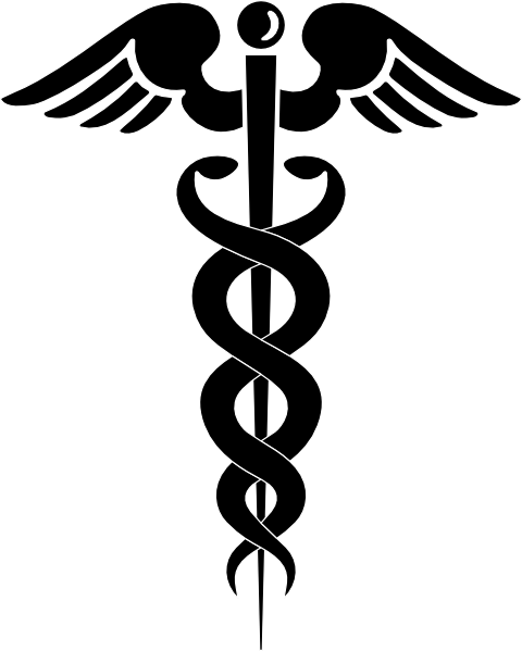
This symbol stands for the medical profession. It is world wide, and upon viewing this symbol on a map or a sign, one would know where to find a hospital or medical center.
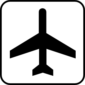
The same goes for this symbol. The common graphic that represents an airport is easily recognizable and can guide someone to an airport should they need to find one.
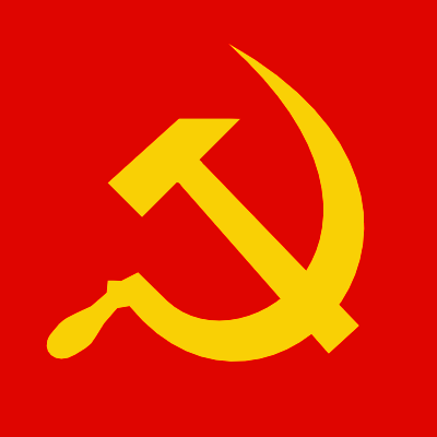
(http://www.tldm.org/News10/Hammer3.png)
The communist symbol is another widely recognized graphic. The graphic can stand for revolution, the proletariat, the peasantry, agriculture, or international solidarity. Communist states, parties and movements use these symbols to advance and create solidarity within their cause.


The common cross walk symbols are seen every day. They are simplistic, and by using both color and identifiable shapes, someone who wants to cross the street is informed of when a safe time to cross would be.

This image has a couple benefits. It is the neighborhood watch symbol, and it both instructs thieves away, as well as providing security for ones home.

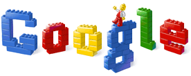
Though the graphic is not as simple, and is more of a literal direction, legos use the same principle for the design of their construction manual. There are no words, but simply the pictures of how to assemble the blocks and what order to put them together in.

After viewing this image I was reminded of other symbols that are very similar:

This graphic is a warning message used by nintendo before most of their games on the Wii console.
The message uses graphics to show how to properly use the controller, and to be aware of how close you are to things so you dont make the mistake of hitting them.

This is a sign that would be put in a park, or anywhere animals might be. It instructs the viewer to not feed the animals.

This is a graphic all of us should be familiar with. It signifies that something is designated of a handicapped person. The symbol is used to prevent people from taking parking spots from people who would better benefit from them, as well as guiding people with disabilities to things that make access to a building easier.
Friday, January 14, 2011
Peace Sign
After reading the story of the peace sign and how the orientation of it has meant different things, I am immediately reminded of the cross symbol. Right-side up, it is the Christian symbol, flip it upside down, and it can mean anti-Christianity, or reference the cross of saint peter.

I am also reminded of the many signs of peace other than the infamous peace sign. Along with this symbol, there is also the peace hand sign as well as the dove with the olive branch, symbolizing peace on earth.


I am also reminded of the many signs of peace other than the infamous peace sign. Along with this symbol, there is also the peace hand sign as well as the dove with the olive branch, symbolizing peace on earth.


The Swastika
One of the stories behind the swastika is that it is a composition of "L's" standing for Life, Luck, Love, and Light.


"According to one source, Dr. Friedrich Krohn designed the classic Nazi Swastika in 1919. Unlike the rest of Germany, Dr. Krohn acknowledged the ancient Buddhist use of the symbol, and argued that the Nazi Swastika should point "anti-clock-wise" because the symbol signifies "fortune and well-being" to Buddhists.
Hitler demanded that the Nazi Swastika point "clock-wise," which Buddhists believe represents a "cessation" or "away from God.""

The swastika had many different meanings and is used in a variety of different cultures. I found a diagram of some variations of the swastika symbol.

Wednesday, January 12, 2011
Isotype
The simplistic art style of the isotype reminded me of the popular video game portal. The graphics are very minimalistic, clean, and depict things in a very simple matter.


I also found a chart made using isotype that shows the statistics of deaths in Iraq in the year of 2007. Isotype can be used for a large variety of things.

There is a pretty big variety of charts utilizing isotype. Follow the link for more.
I did a Google search for Gerd Arntz and found some more of his artwork aside from his isotype images.


Follow the link for more.
Symbols: The Alphabet of Human Thought
Reading this article about the different types of symbols made me think of the google doodles. Google has a very recognizable color scheme and the symbol is extremely well known. Even with some drastic changes to the font face, as well as some designs using no type at all, google is still easily recognized. The symbol has power and is a very good example of the power symbols have in our culture.
The website has a ton of different spins on the logo. I have listed only a few of my favorite:
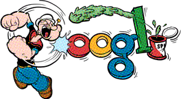


The website has a ton of different spins on the logo. I have listed only a few of my favorite:


follow the link for more
The article mentions that chinese writing itself is an artform. The characters are pictograms, and while looking online I found some artwork made with chinese characters.


follow the link for more
I think it's very interesting to see how a brand or logo changes over time. I found a project done by the people at Antrepo4.com where they have redesigned a variety of products in a very minimalistic way.


follow the link for more
Tuesday, January 11, 2011
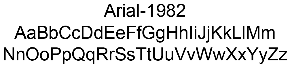
Exercise One: Icon Set
For my icon set, I used Arial. Arial is a font that was developed in the 1982 by Robin Nicholas and Patricia Saunders. Since the 80's was the age of digital technology, I thought it would be fitting to make a set of icons based on the electronic technology of the time. Arial is a sans-serif typeface and the simplicity of the letters lends well to the design I chose.


Subscribe to:
Comments (Atom)